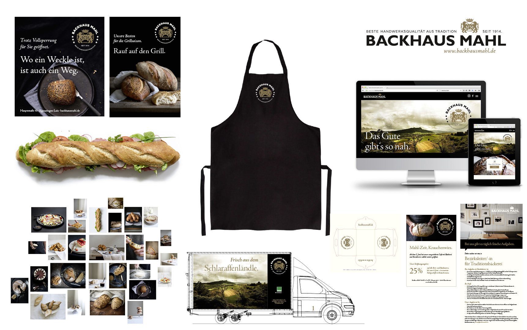
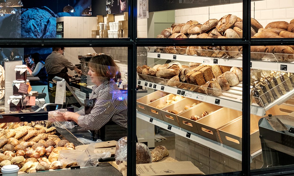
Backhaus Mahl wanted a uniform brand identity that focuses on the company's values. It should be modern but simultaneously emphasise the tradition of the baker's trade. It was important to get people excited about the products and to show that Backhaus Mahl is by no means a large-scale industrial Bakery.
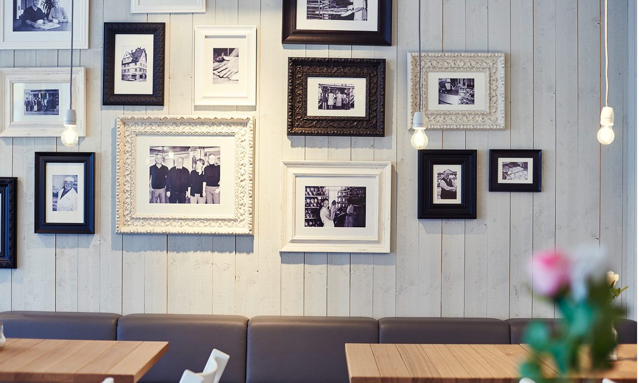
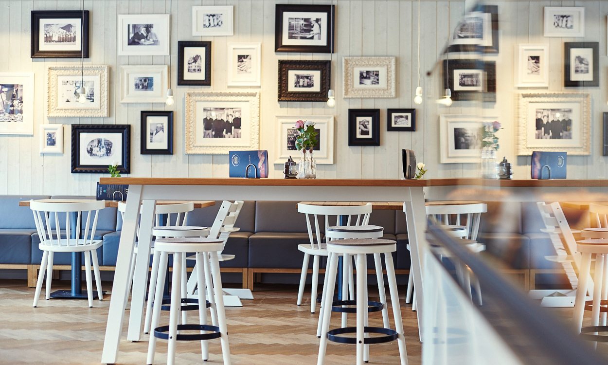
For us, the most important thing about the company's appearance was to convey to the customer that Backhaus Mahl is not an impersonal industrial baker, despite their more than 30 craft bakery shops. We wanted to prove that here, they make a point of craftsmanship. That is why we prioritised three aspects when creating the new corporate design for Backhaus Mahl: Craftsmanship, craftsmanship, and craftsmanship.
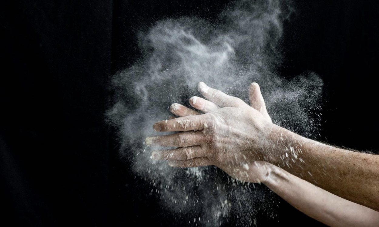
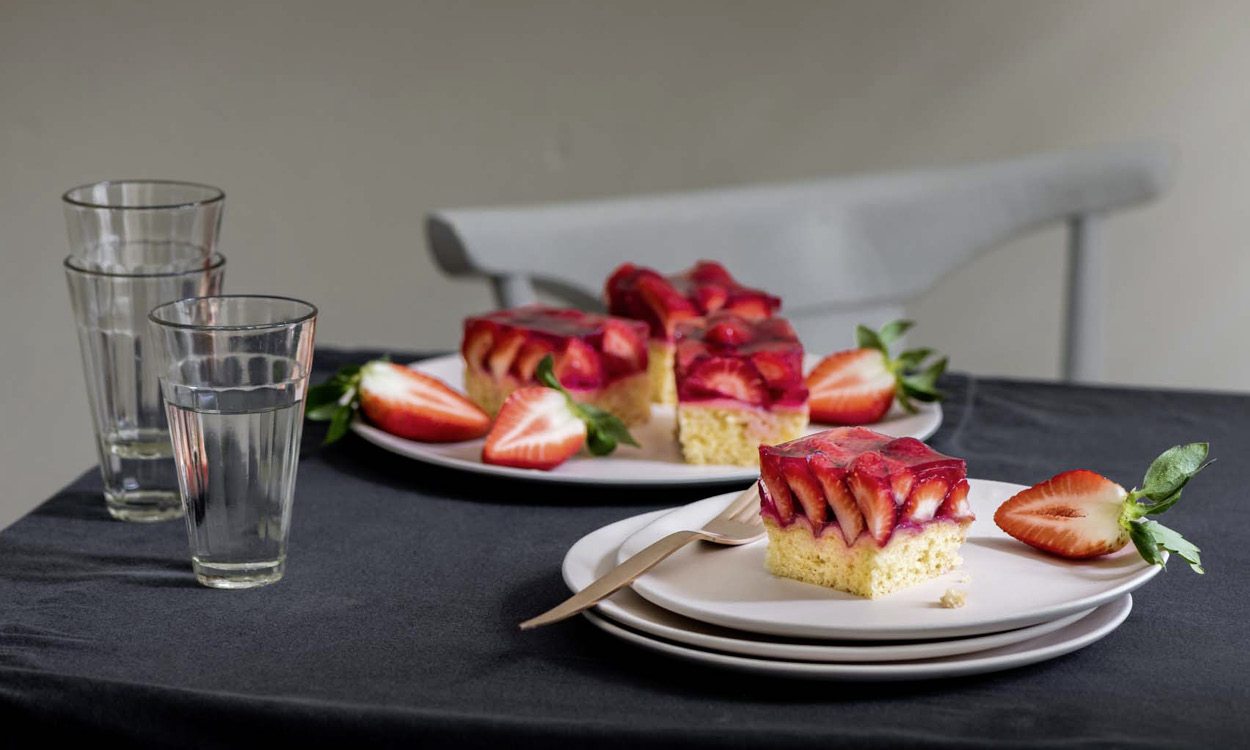
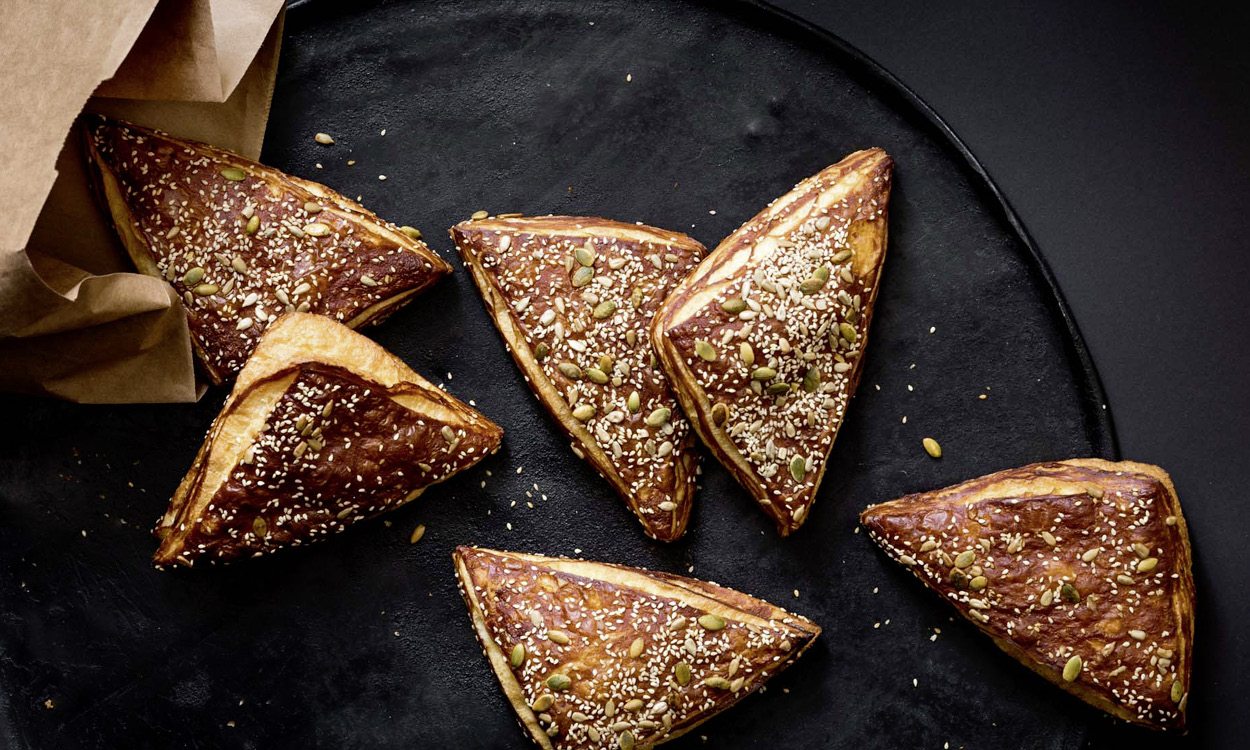
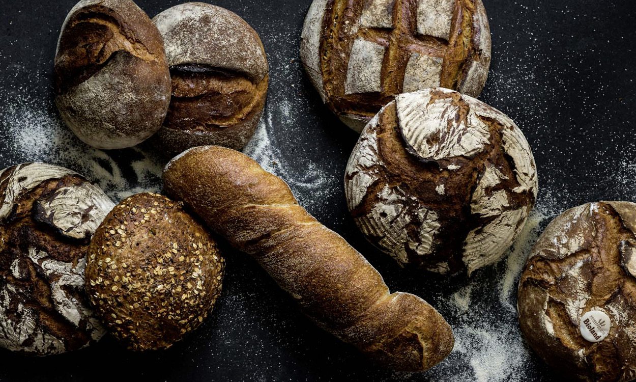
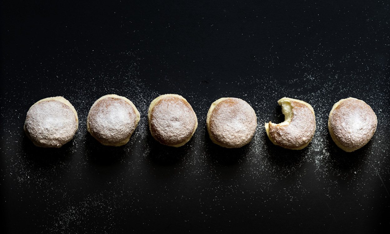
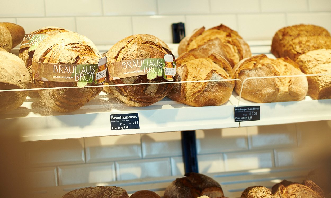
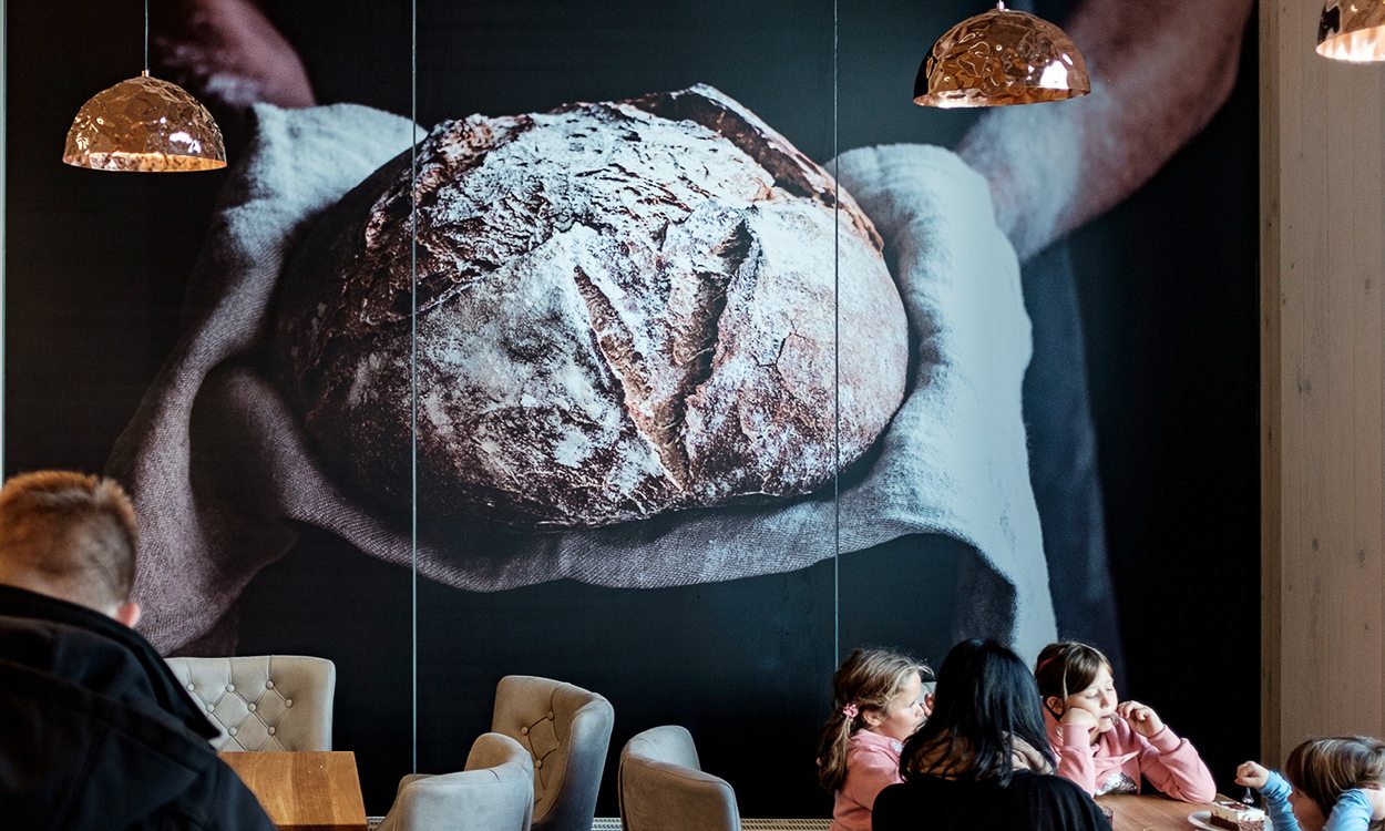
Therefore for us, there could only be one protagonist. The product. Without any distraction by a sumptuous, elaborate presentation. Concerning the imagery, the idea was to let the products speak for themselves. All by themselves. This is why the product presentation was designed to portray the craftsmanship and the authenticity of the products. In collaboration with the well-known photographer Winfried Heinze, we developed an image design that not only focuses on the products, but also on their handcrafted nature. In other words, unlike in usual advertising shootings, the "problem zones" of the models were not retouched.
When redesigning the logo, the idea of craftsmanship was also in our centre of attention. Besides the lettering 'Backhaus Mahl', the promise (Traditional Quality Craftsmanship), the seal of the trade guild, and the proof of tradition (since 1914) convey trust and credibility to the customer. With Adobe Jenson Pro, we opted for a font with a classic style. Its handwritten look and the resulting imperfection optimally reflects the craftsmanship that is inherent in Backhaus Mahl's products. It is authentic and not as artificially flawless as computer-created typefaces. Just like the breads and rolls from the bakehouse.