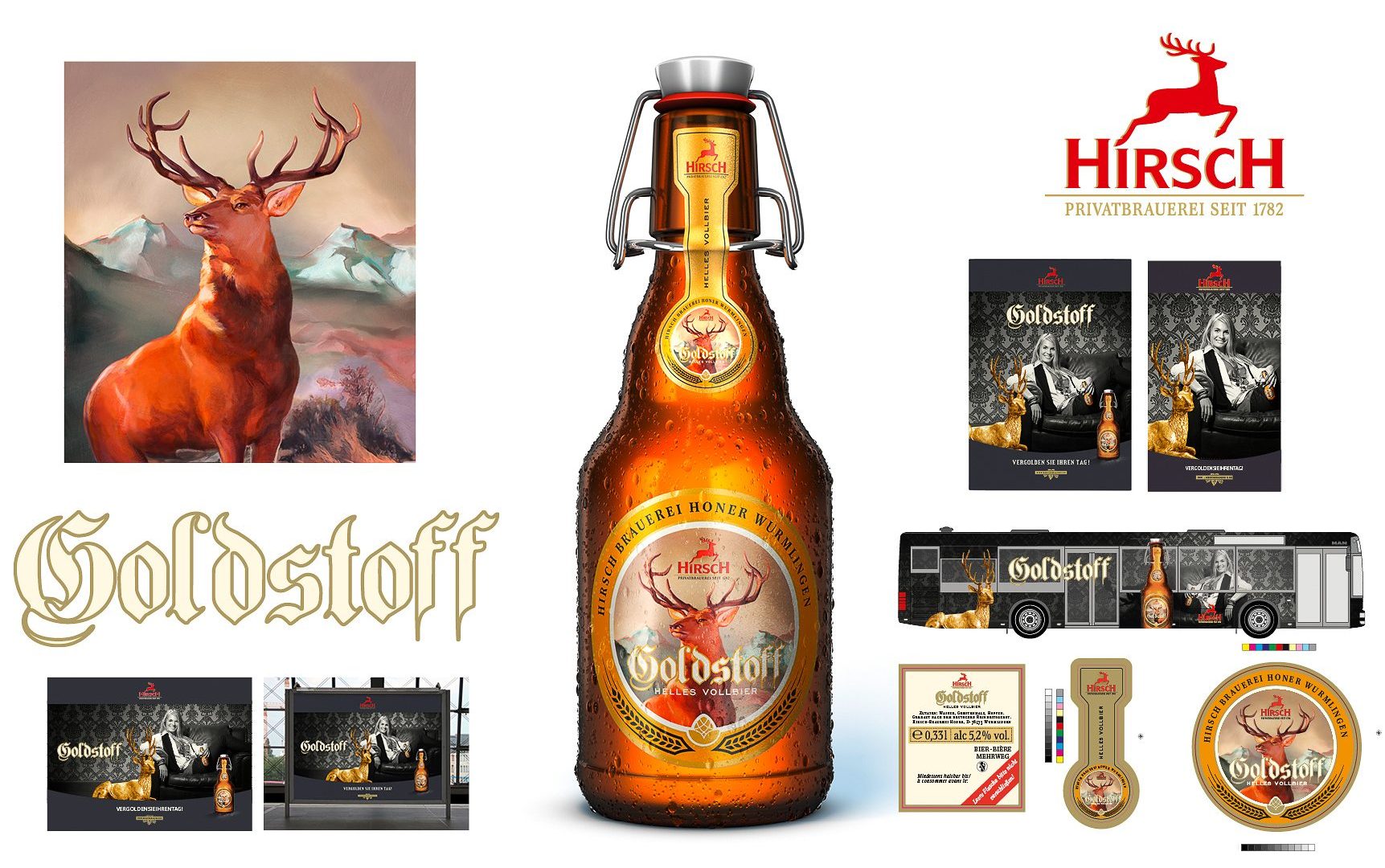
Hirsch developed a new beer – a full-bodied, golden yellow lager with a round, smooth body. This was to be launched, with the complete package. This includes everything, from the name and the label to all necessary marketing measures. The goal was to reach a younger target audience with a traditionally brewed beer.
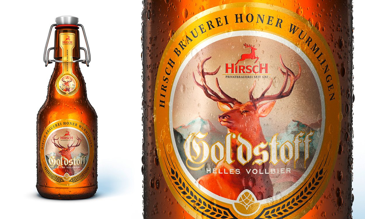
A name for the new beer was quickly found. Once we saw its golden yellow glow in the glass, it was obvious: Gold Stuff.
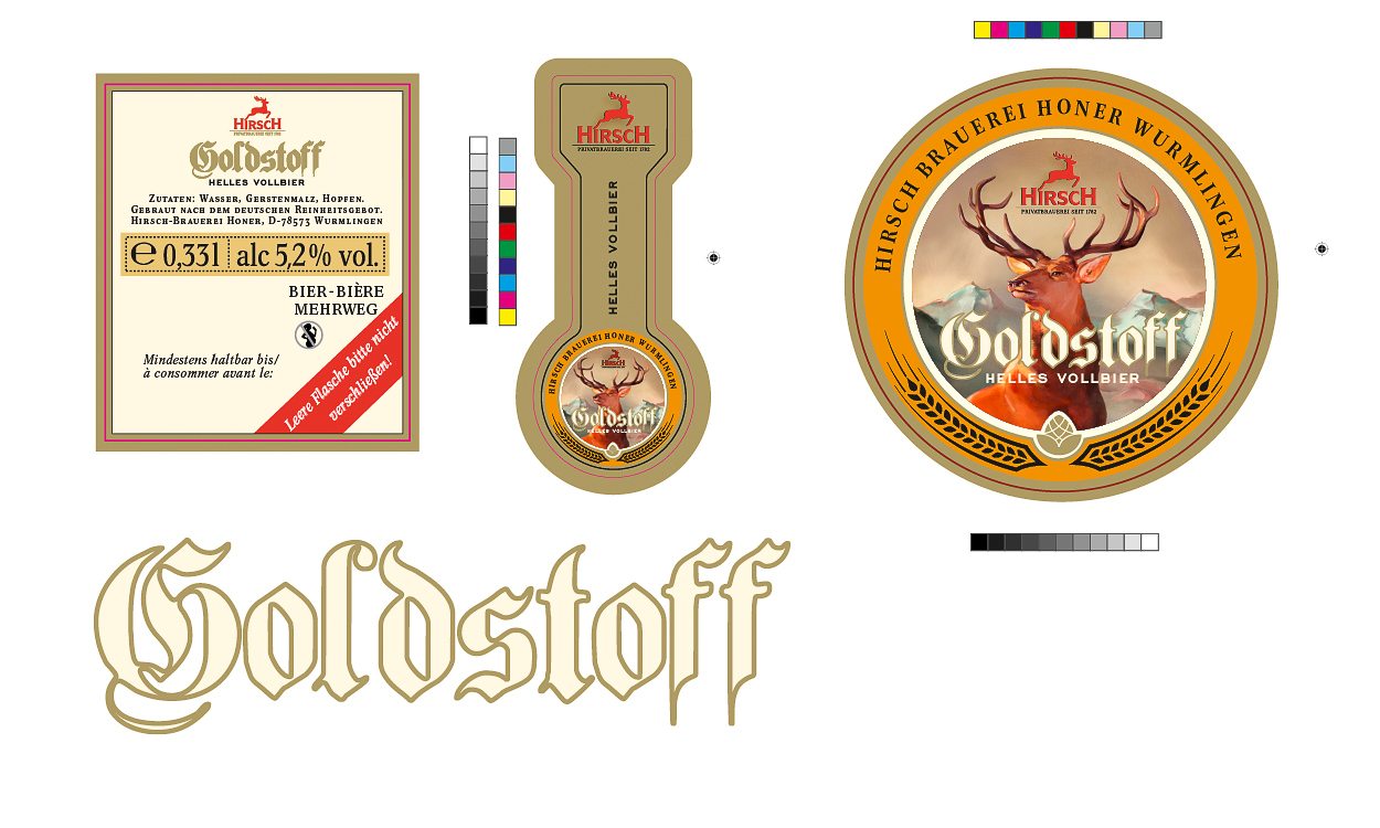
When designing the label, it was important to us to emphasise the traditional embossing of the lager. That is why we opted for a historically looking motif with a stag in a slight retro design.
Along with the trendy bottle, we positioned Hirsch Gold Stuff as a fashionable beer for a somewhat younger target audience.
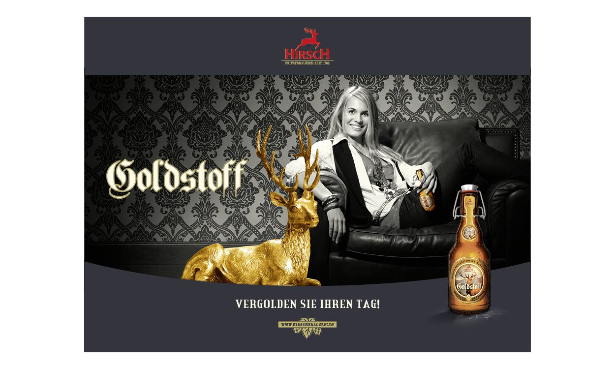
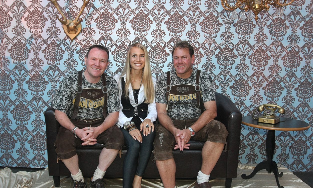
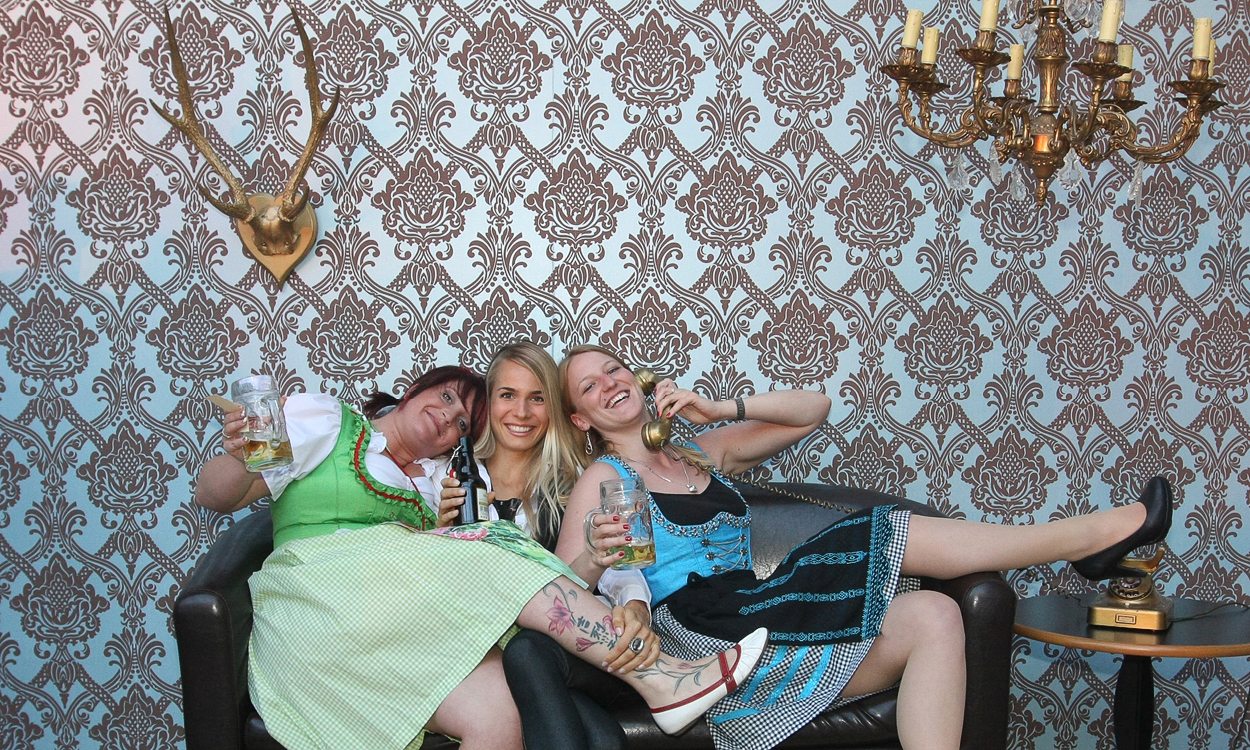
To build the bridge from the tradition of the beer to an up-to-date positioning, we placed all our bets on stylish pretentious kitsch when designing the campaign motif. The patterned wallpaper, the golden stag and the black and white look – all that pays into one theme. The consciously chosen feminine testimonial adds a certain lightness to the concept and also heads for the desired younger audience.