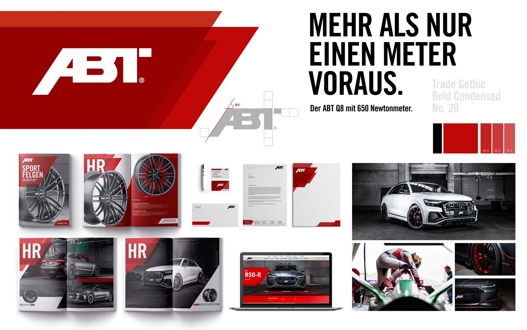
ABT is the number 1 when it comes to tuning VW vehicles. And one of our most loyal customers. It was, therefore, time to finetune the corporate design to catapult it into the year 2020.
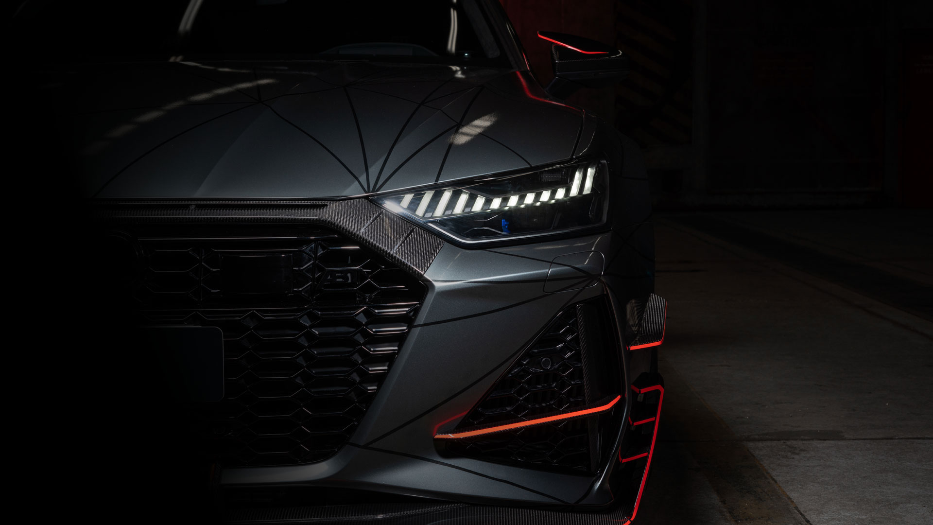
The main task was to consistently further develop the existing style and to fit the three brand segments, Sportsline, Motorsport, ABT E, under the right engine bonnet. The new wheel rim brochure and the revised trade fair appearance were the first qualifying element for the new CD. In addition, we were able to help our friends, who are based in the Allgäu and are passionate about vehicles, with the design and voice narration for the presentation films for the ABT RS6-R and RS7-R.
After 12 years, we have further developed the dynamic ABT lines. The dynamics remain the same, but the power increases. This creates a radically different style, derived from the angle of the ABT-A with the ABT brand bar as a central and flexible design element.
As such, in combination with distinctive visual imagery, we were able to create a uniform framework for all measures, which is an even better fit for what ABT has always been about: from the racetrack to the road.

