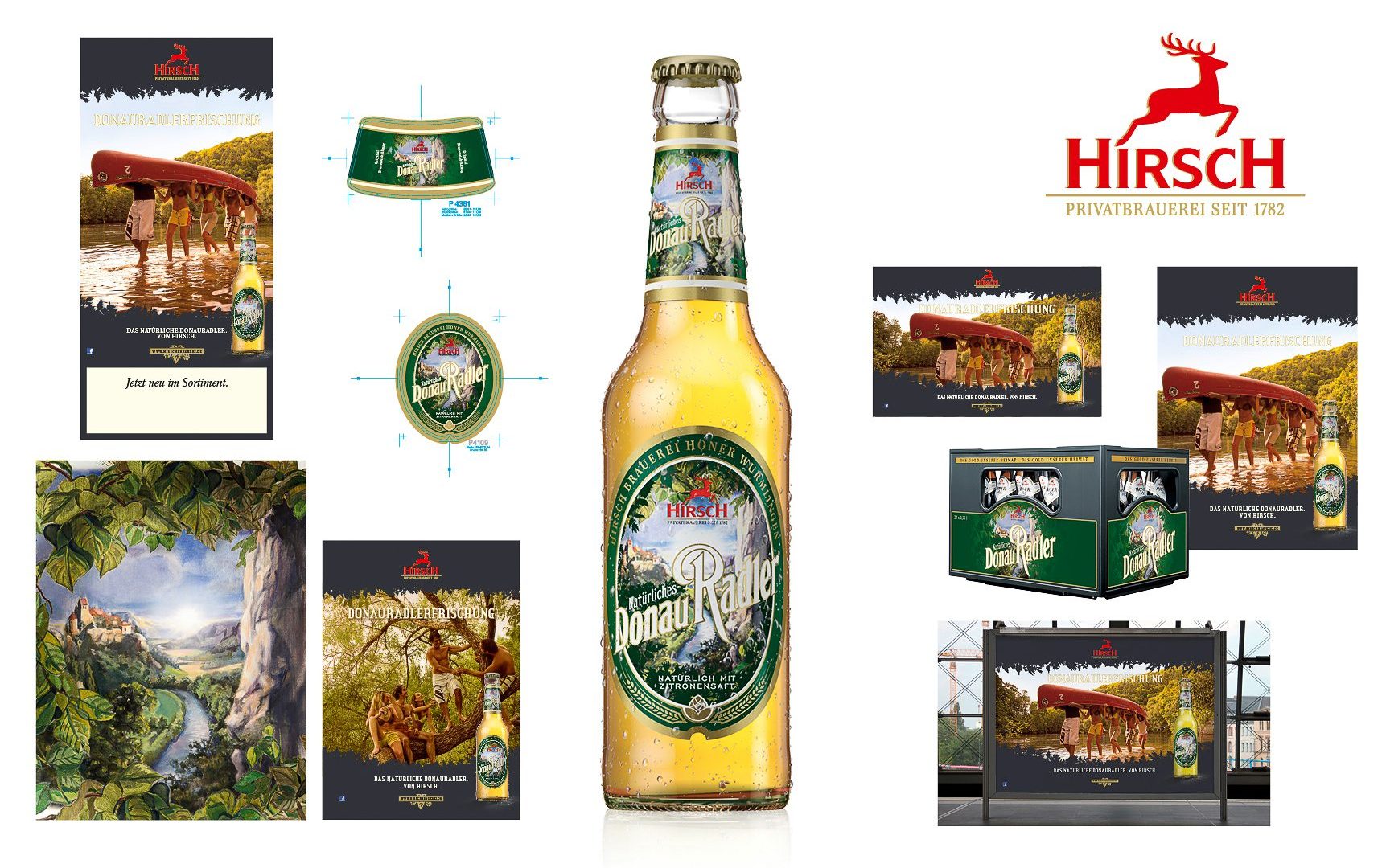
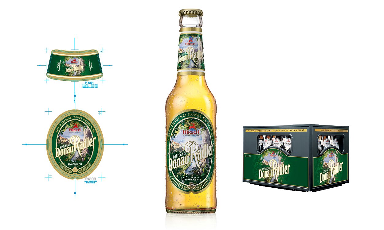
The private Hirsch Brewery has redesigned their Danube Radler. Completely free from artificial ingredients, it promises a refreshingly natural flavour. Hence the new name 'Natürliches Donau Radler'. This innovation was now to be introduced to the customers through communication measures in print, as well as a new label design.
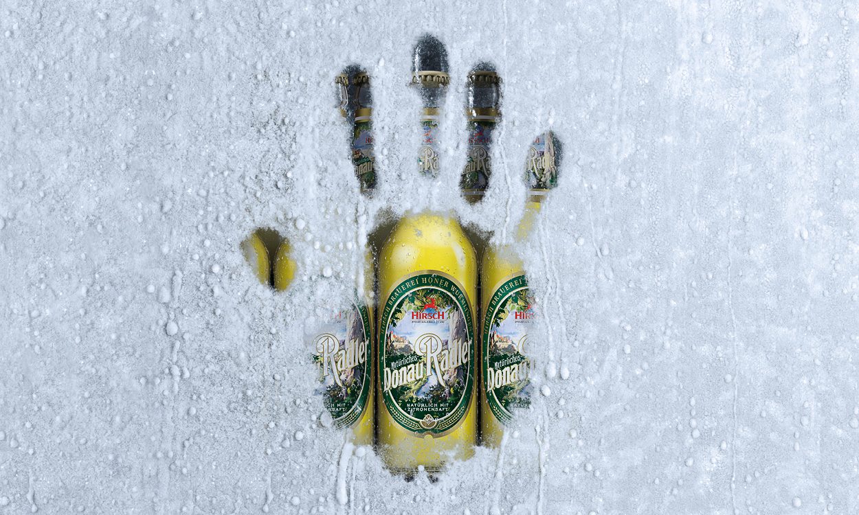
Also, a new Danube Radler was launched as part of a range extension. Namely the Donau Radler White Non-Alcoholic. A completely new design was needed, from the crown cap to the labeling, and the campaign theme. However, its appearance had to seamlessly tie into the design of the Natural Danube Radler.
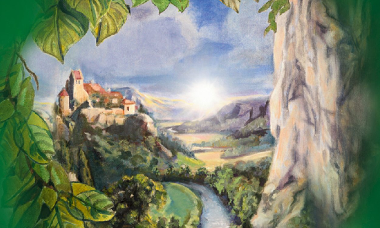
As the name suggests, the main focus of the Donau Radler is on its regional origin. That is why our goal was to continue to reflect that on the label. The illustration of the Danube valley should therefore remain. However, its modernisation was crucial. In order to meet our high standards for the illustration, Victoria von Kap-Herr was hired as an illustrator.
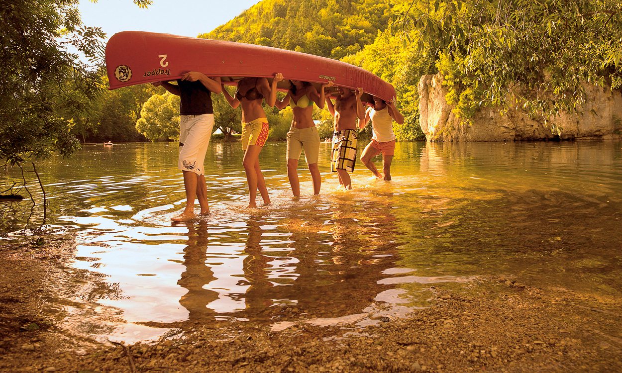
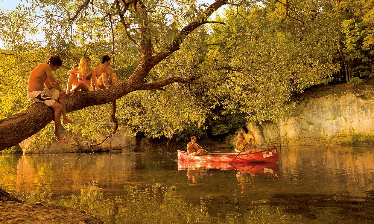
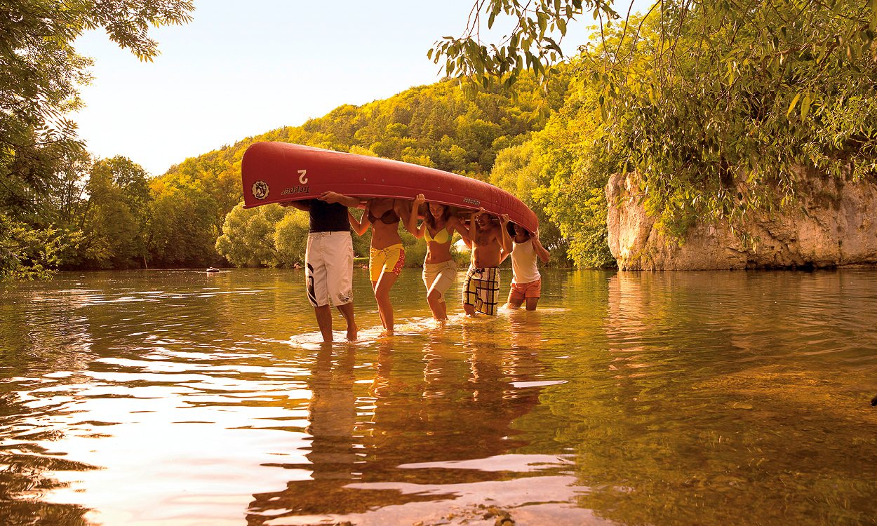
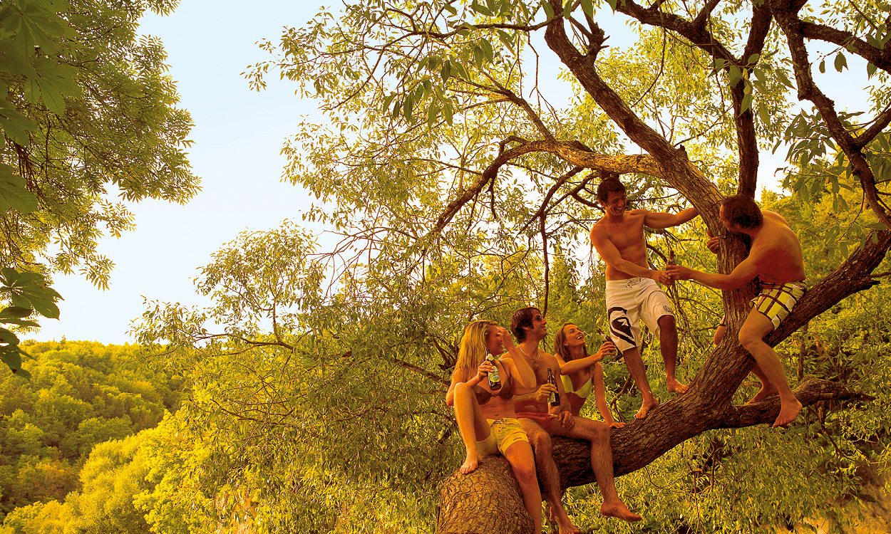
We also took up regionality when designing the themes for advertisements, posters, and the key visual. Fully in the spirit of the typical Danube trippers. We show them exactly where they like to enjoy the Natürliches Donau Radler best. Naturally, at the Danube – just in the nature.
With Danube cyclists white alcohol-free we have strongly orientated ourselves in designing labels and campaigns motif, as required in the lettering, heavily on the natural Danube biker. However, the gist of the message, focused on the enjoyment of a non-alcoholic beer, was implemented humorously in the headline.