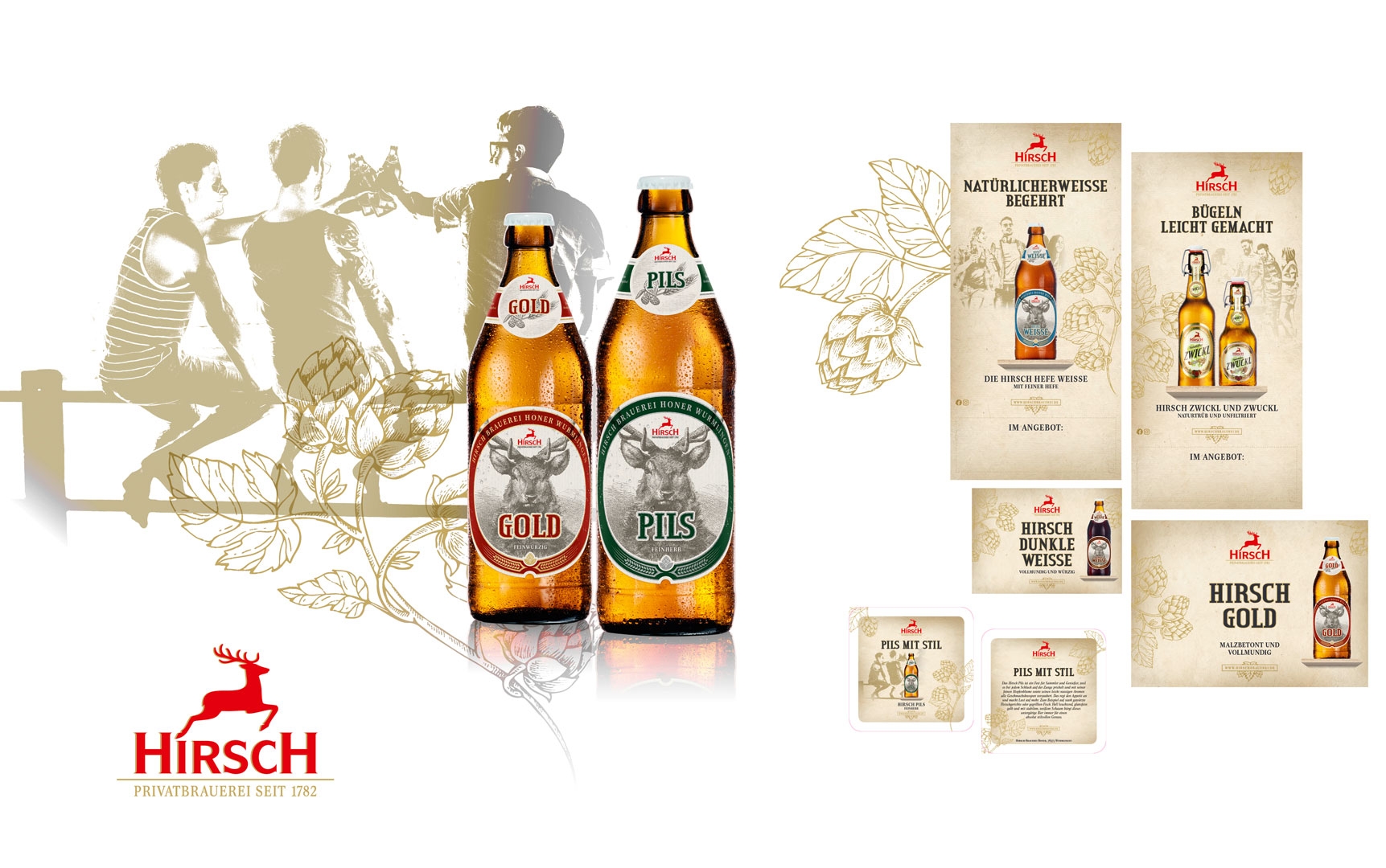
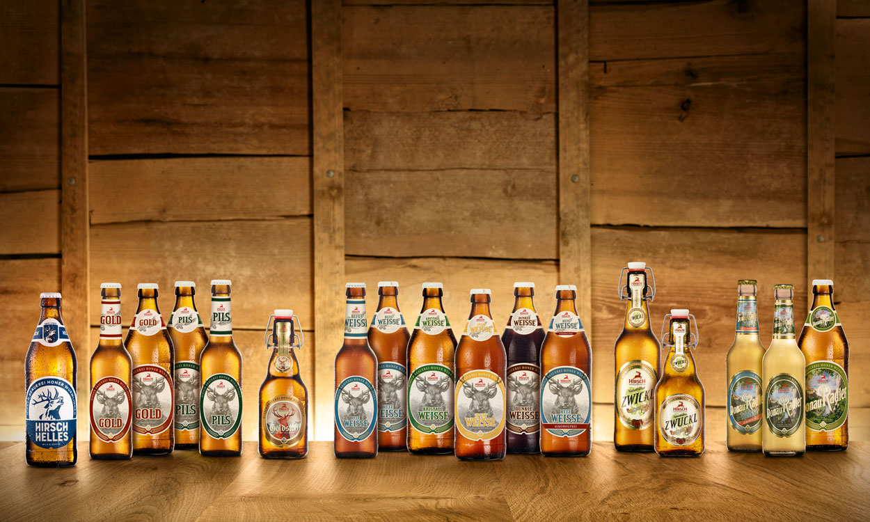
Hirsch has made the change to a new container. The Hirsch Gold, Pilsner and five ‘Weissen’ and the Donauradler are now available in the Euro bottle. A new container means a new label, a launch campaign and a new image – thereby setting off a whole series of events all leading you straight back to the stag (Hirsch). And so that is what we put right in the centre.
For many years now, we have fought to have the stag looking straight at the onlooker on the label. Sometimes in deep red, sometimes in a rich green. With the change of containers, the stag has prevailed, now appearing in different colours depending on the beer type.
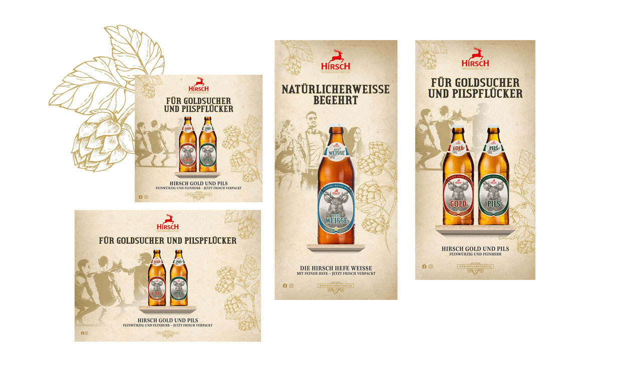
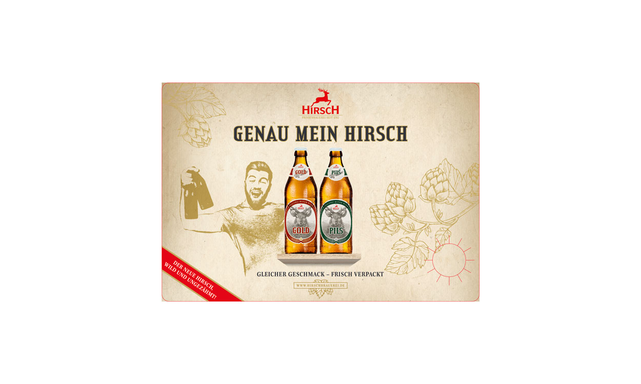
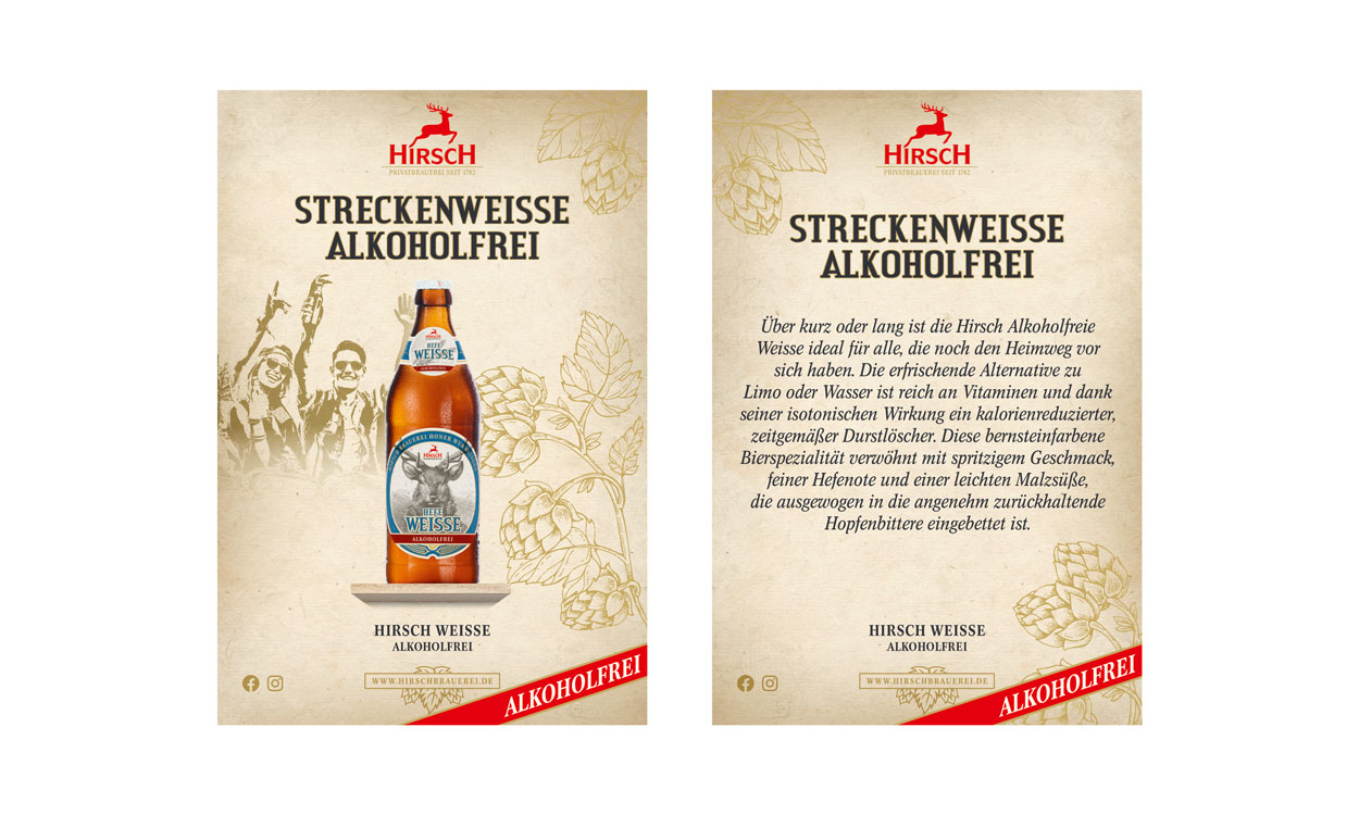
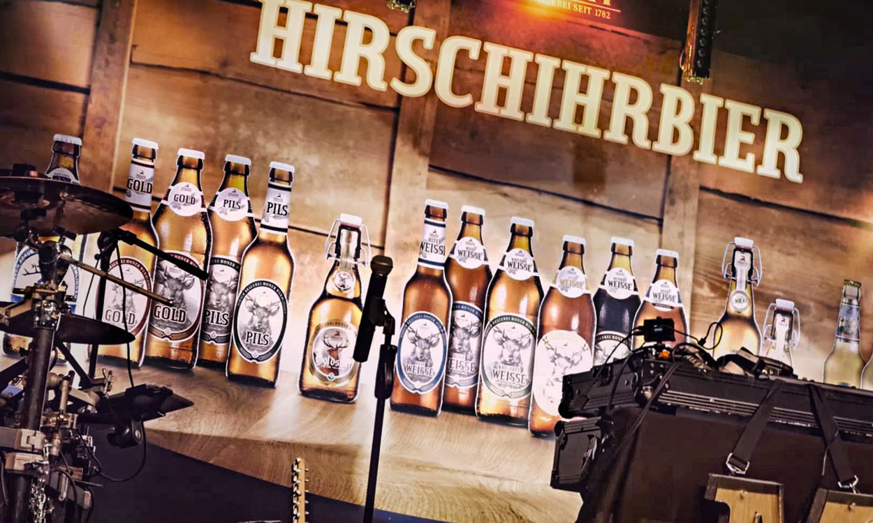
For the launch campaign, we developed a visualisation applying the traditional values Hirsch stands for in a modern way, with a stylish vintage look with real potential to set the scene. The stag is always in the centre. Like antlers on the wall, in the new look it’s a label on the bottle.
And it appears across all the campaign actions – from beer mats, pocket cards and crate stickers to its FB profile image.