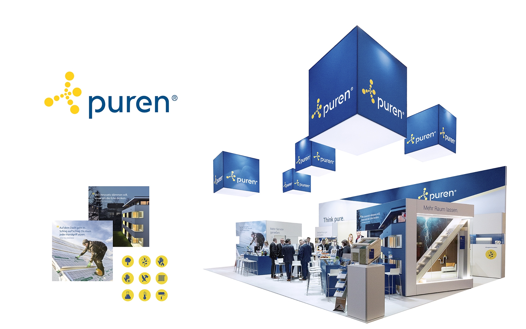
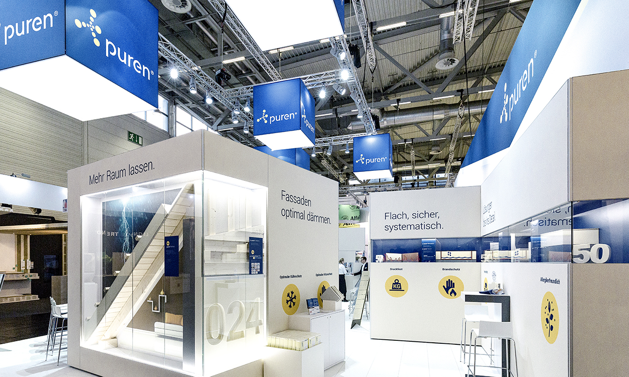
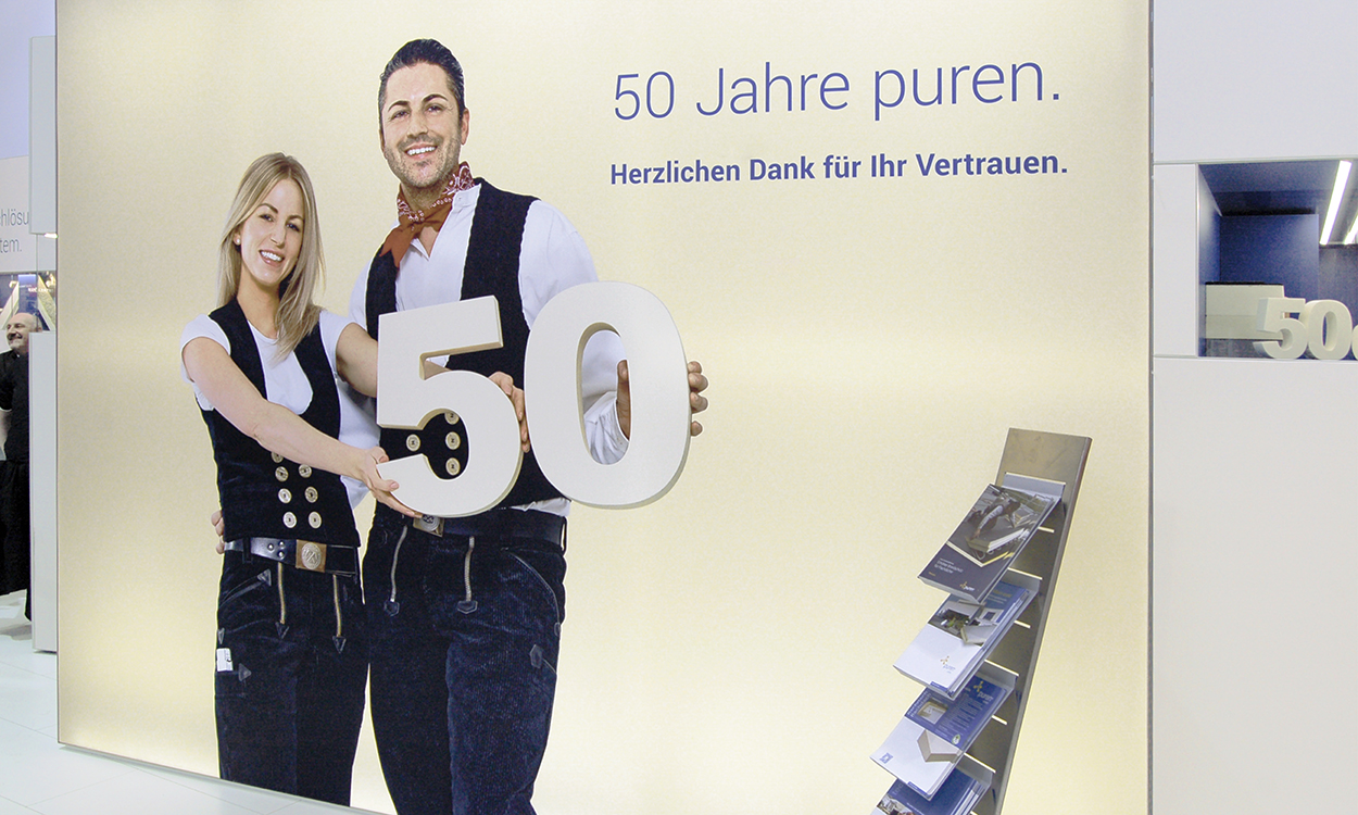
The cubes above the stand should remain in place. But other than that, there is nothing wrong with freshening it up somewhat. Not as grey. Friendlier, more open and modern. The puren exhibition stand. The manufacturer from Überlingen that specialises in producing innovative and energy-efficient PU rigid foam board for building insulation and industrial processing wanted to mark its 50-year anniversary in a fitting manner, standing tall with its appearance at the Dach+Holz 2018 trade fair in Cologne. And that's exactly what happened.
Essentially, it was much more than just redesigning the exhibition stand. It was the first “new look” project for puren. Designed during the conceptual phase of the company's new Corporate Design, which was being developed simultaneously – and its first major test.
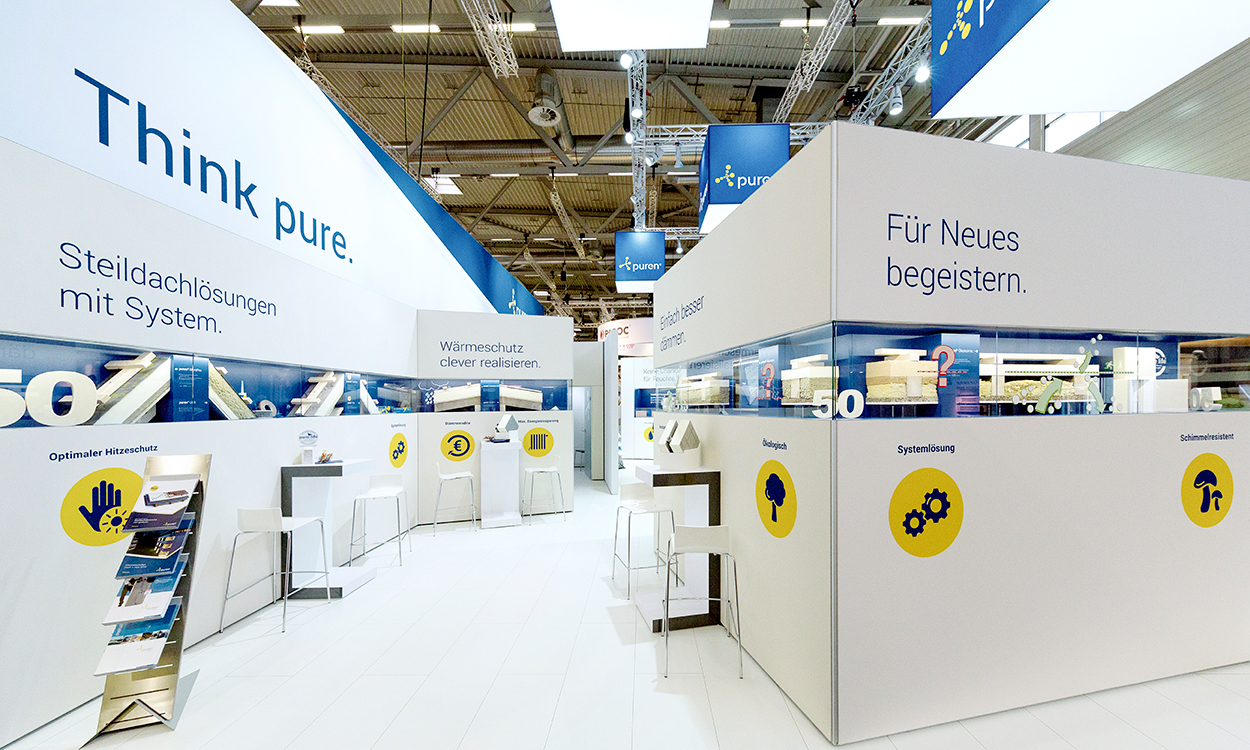
The core and starting point were – as with the Corporate Design – the brand itself and its product, the hard foam board, the colour of which all exhibition stand walls appeared in. The desired effect was subtly underscored by the display cases in a newly defined corporate blue. The cubes positioned above the stand also radiated the same blue tone, while also bearing the company's logo in its approved redesign, for the first time.
Clear messages and new icons – blue on yellow circles, based on the carbon atom used in the figurative mark – rounded off the appearance.