When Ravensburger rebranded the company in the early 2000s with the blue triangle in order to appear more incisive and modern from a visual and linguistic perspective, the idea was that this should also be perceptible in its corporate communications. As part of the brand relaunch, we were entrusted with the development of the Ravensburger Annual Report for 2005. Based on the newly developed brand philosophy, the intention was to discover the core values of the brand. Title: “People and brands”. From 2006 to date we have been repeatedly tasked with designing an annual report.
Our approach: Above and beyond the legal requirement for reporting, the annual report should add to the Ravensburger brand. It should present the brand and the company in an up-to-date and pleasant way. The most important tool in doing this: an image section preceding the balance sheet. As there has been no Ravensburger printed image medium for some time, the annual report automatically assumes the function of an image and corporate brochure and becomes a central communication medium.
In collaboration with Ravensburger, we have therefore designed a new annual report over the years which does the full branding work, externally and internally: The annual report is the external face of the AG – for business partners, the press and the general public. Internally, it provides information on important topics and strengthens the sense of unity.
Documenting the corporate and brand history
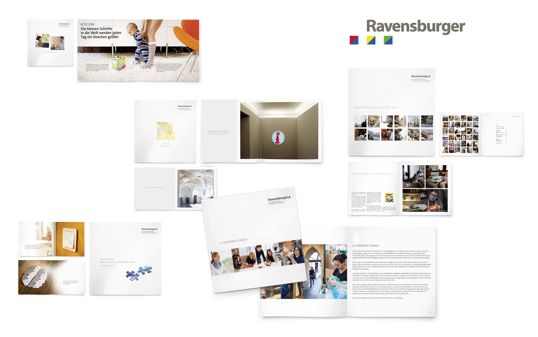
Looking back at around ten years of the Ravensburger annual report, it becomes clear: This is the story of a brand and corporate history: A story of current changes, crucial topics, products and people, values and principles and of course financial growth.
Frequent core themes: Brand, company and its values
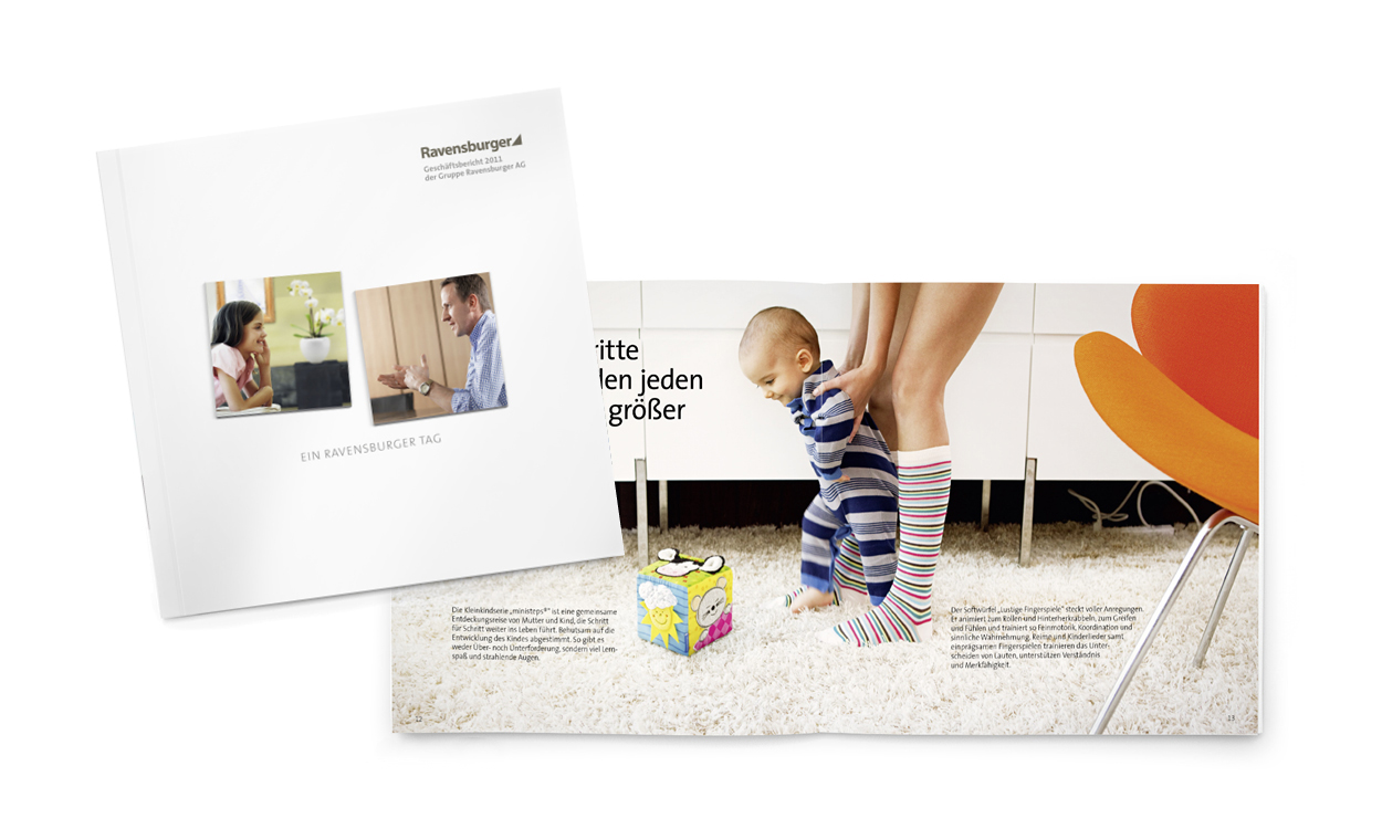
Particularly in the first few years after the brand relaunch, but again and again thereafter, it was all about values. The 2006 annual report presented “Ravensburger Moments” – an image sequence about the joy, education and togetherness that Ravensburger games, books and leisure activities provide. In 2007, employees from various divisions spoke about their work and their love for Ravensburger under the heading “We are Ravensburger”. To celebrate the 125-year anniversary, the 2008 annual report documented the “Ravensburger Mindset and Values” and explained how content and material quality as well as responsibility manifest themselves. When a study proved that Ravensburger and its customers shared common values, we made the expanded family of values a key topic in the 2011 annual report: Alternating between companies and consumers, “A Ravensburger Day” demonstrated how Ravensburger quality comes about and how it is experienced.
Special products and a museum
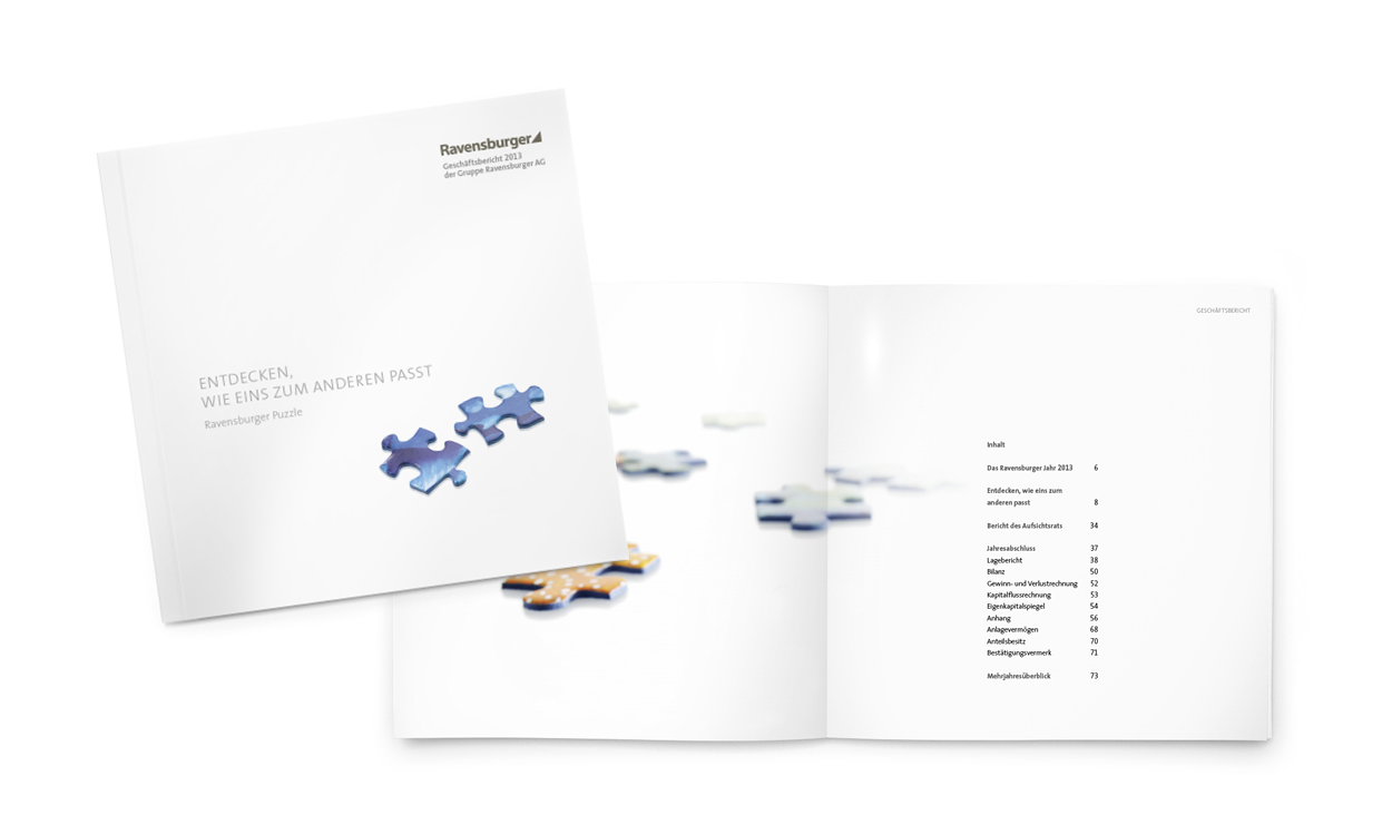
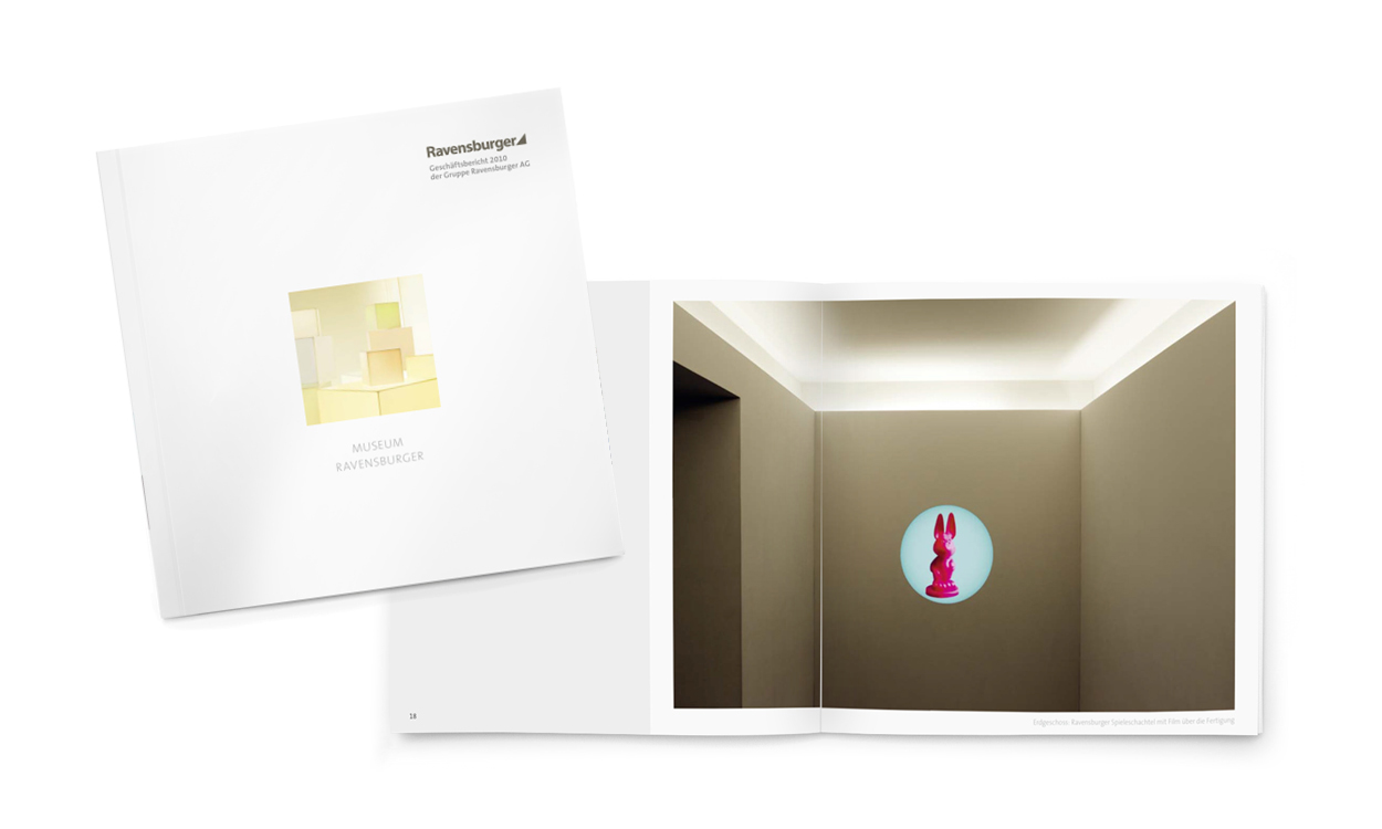
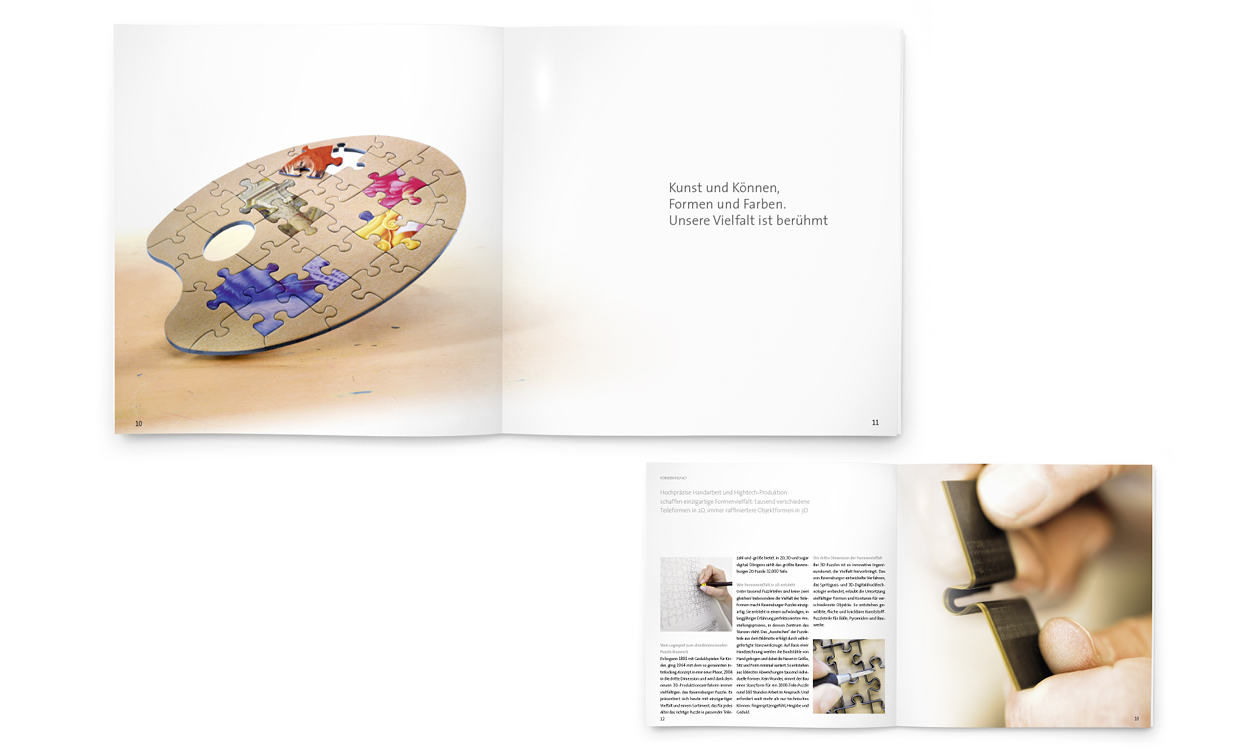
Products have been the central focus of an annual report twice now. 2009 memory®, the best-known Ravensburger product brand, on the occasion of its 50-year anniversary. And in 2013 it was the puzzle product category which had launched a successful innovation during the reporting year. When the Ravensburger museum reopened with a new design, the 2010 annual report acknowledged this with a photographic tour of the building and presented it with all its tension between history and modernity: in short, as a mirror image of Ravensburger.
The annual report as a strategic manifesto
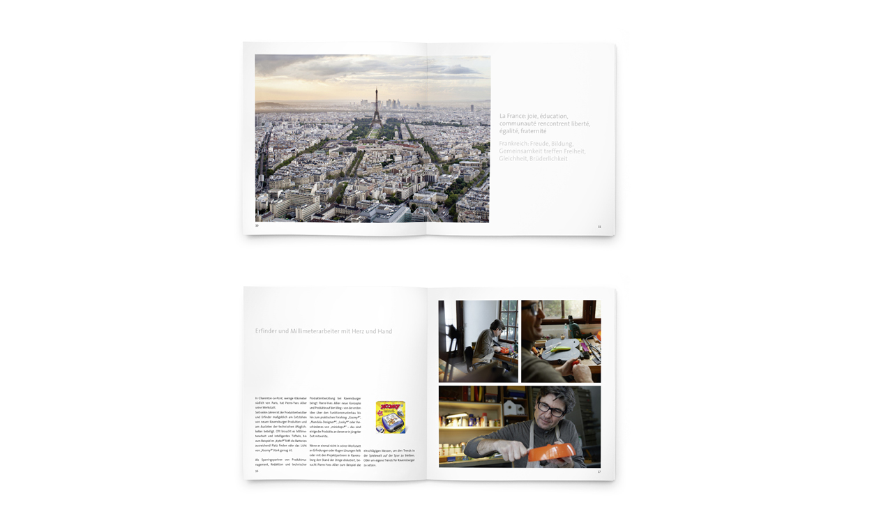
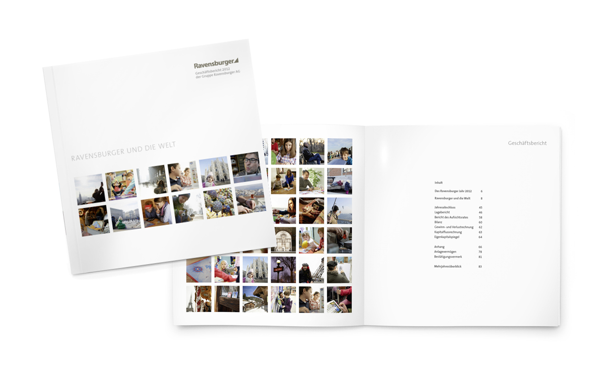
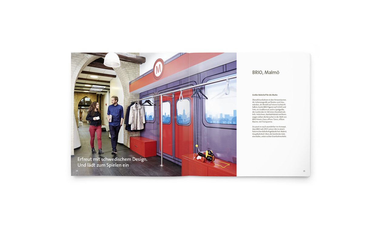
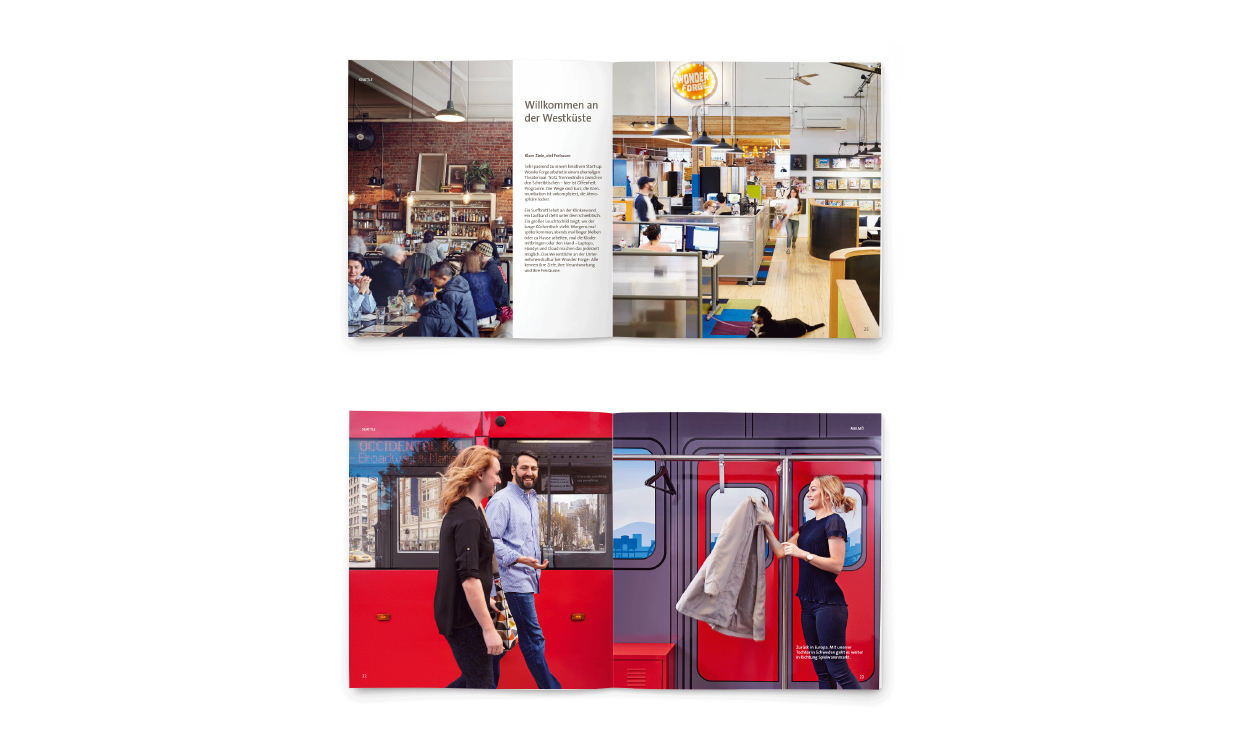
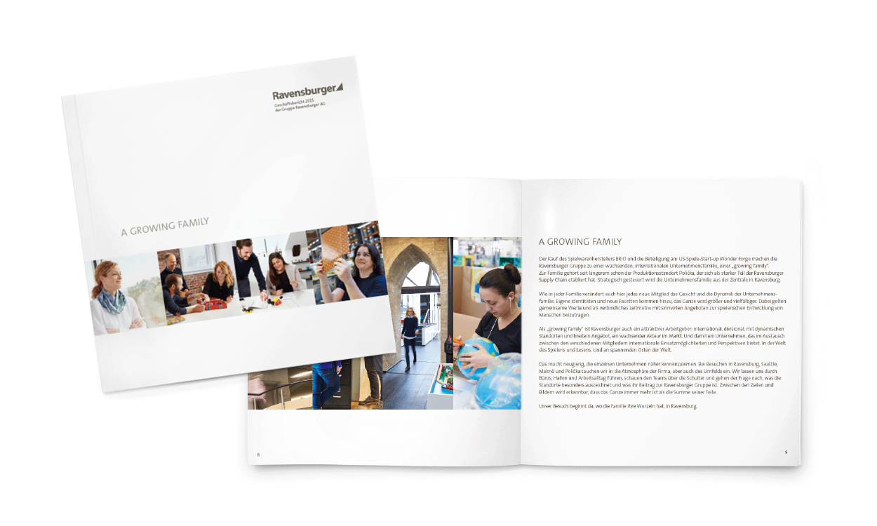
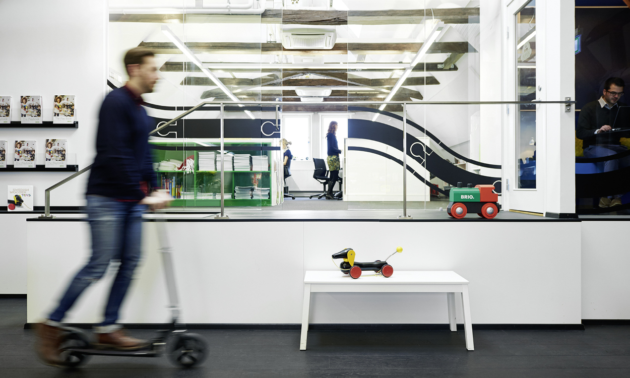
The increasing internationalisation of the company was also part of the creation of the annual reports. “Ravensburger and the World” 2012 set the tone with a foray into overseas markets and subsidiaries in Europe and overseas. The 2015 annual report continued to push this topic forward and presented Ravensburger as a “growing family” with images, people and stories from important sites.
Employer branding externally and internally
The effect of the annual report on the company cannot be underestimated. The content of the image section makes a contribution to understanding, motivation and sense of community amongst employees. After the brand relaunch, for example, the annual reports made a significant contribution to implementing the core values. Often employees were the subject of focus, which created identification models. “A growing family”, the 2012 report, which amongst other things presented the production site in the Czech Republic, was also printed in Czech at our suggestion. This is a strong indication of our esteem for the employees, which also had an integrating effect.
The annual report is also becoming increasingly important in HR marketing externally. In an ever-more competitive market for people with real skills – whether it’s in the Upper Swabian provinces or in the Czech Republic, the idea is to present Ravensburger as an attractive, international employer. In addition, conveying values contributes to an important initial fit between companies and applicants. Where there is no thorough employer branding, the annual report is in fact the central medium in employer marketing. It comes as no big surprise that the Human Resources department regularly uses the annual report for applications and interviews.