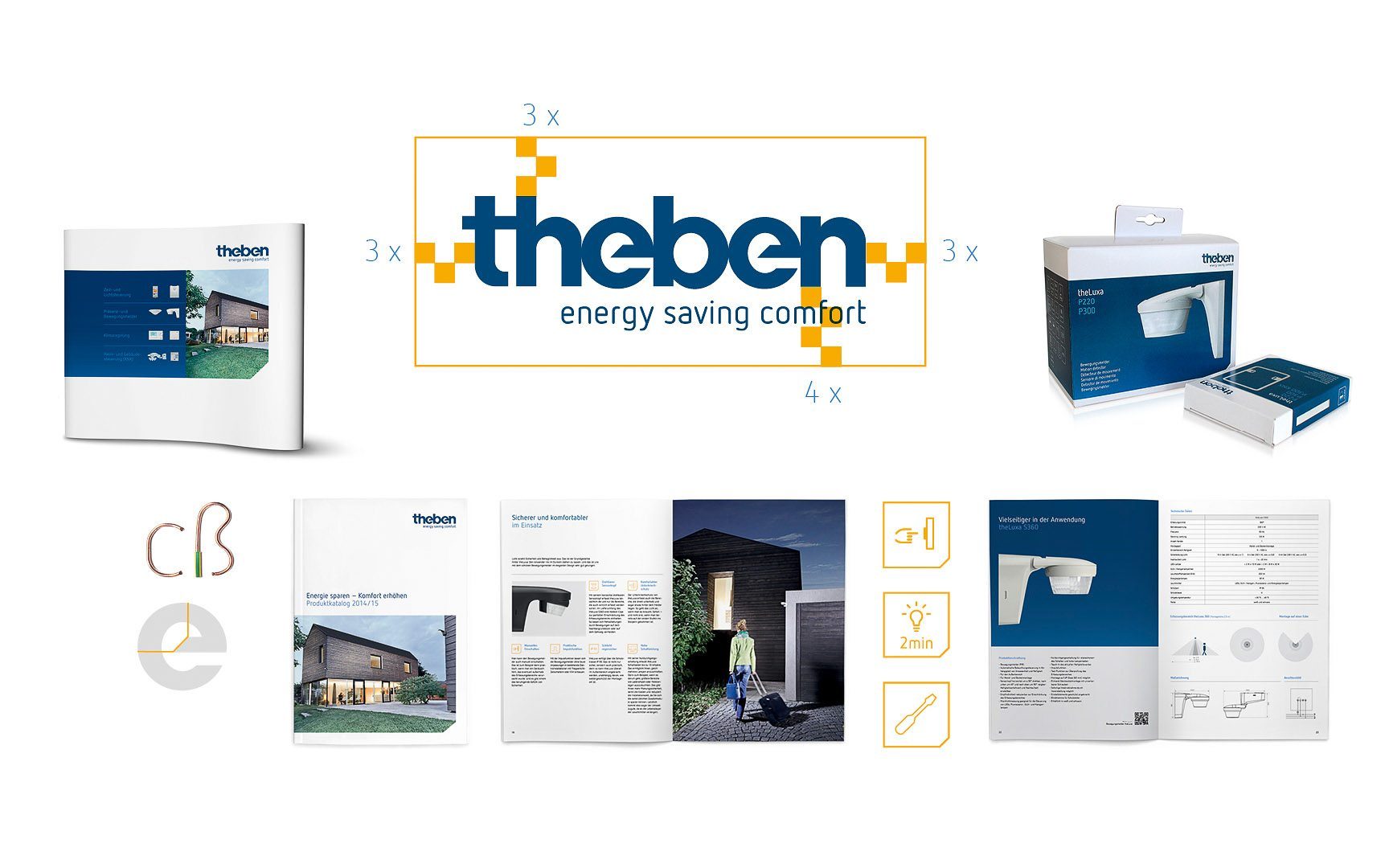
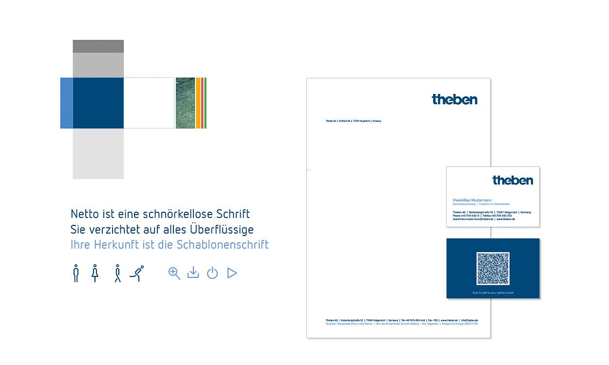
Brand management is one thing. For Theben, we established a comprehensive branding process. From the claim to the logo to the colour and image world, we designed the brand identity for the Haigerloch family company. But how can internal implementation be ensured? Through a CD manual that is reduced to the essentials and that provides employees and suppliers with all the information they need at hand when implementing a brand consistently.
It is crucial that you can work with it. And that you want to. Corporate designs give brands their appearances. They guarantee the recognisability of a brand. However, they are perceived by many as a corset that one prefers to strip sooner rather than later. That is not the case with Theben.
AN OPEN FRAMEWORK FOR BRAND-RELATED COMMUNICATION.
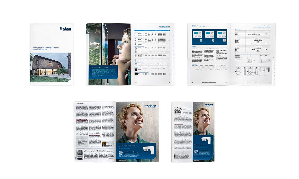
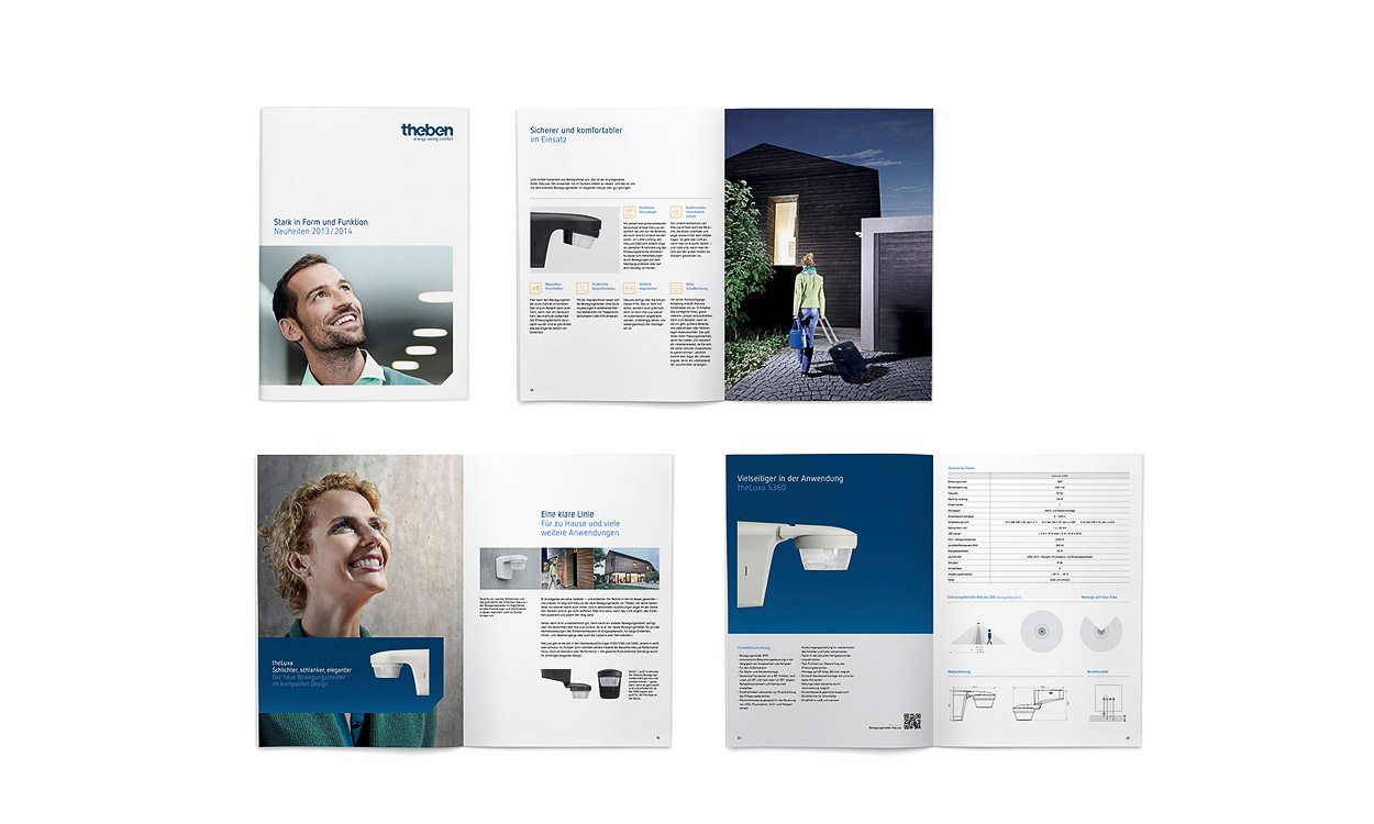
The corporate design we developed for Theben is open enough to be able to relate to all the issues relevant to the brand. And at the same time it is so clear and compelling that its implementation simplifies everyone's routine business who communicates in the name of Theben.
THOROUGHLY EXECUTED DESIGN FOR ALL APPLICATIONS.
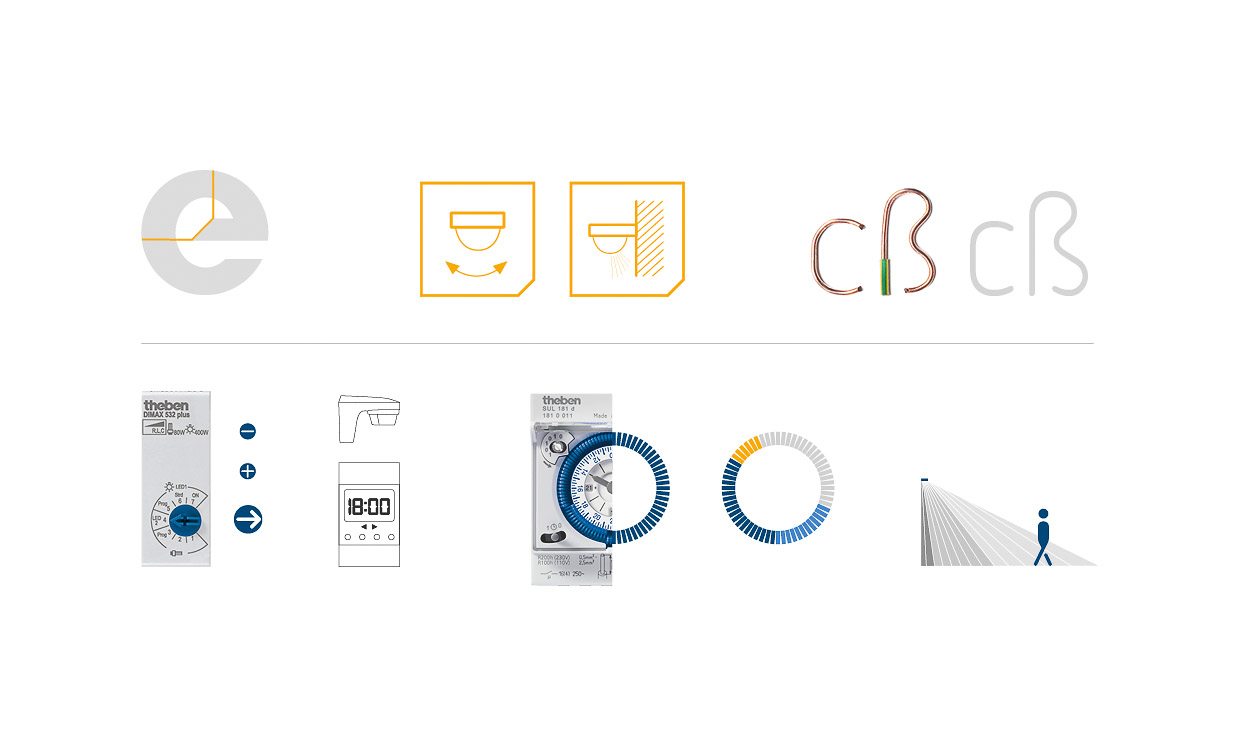
Grid, typography, icons, and dimensions are an expression of rational criteria that correspond to the thinking of the engineers, installers, and technicians who work for or with Theben.
Recognisability is also ensured through typical design characteristics that derive from the word mark itself: The typical corner of the E in Thebes, that recurs in text fields in advertisements, brochures, and on packaging. Also that is a reflection of mindfulness, the company's core value.
VISUALIZED VALUES IN COLOUR USAGE AND IMAGERY.
The colour world conveys confidence and reliability through primary and secondary colours. Rooted in the company history, adapted for a modern and high-quality look.
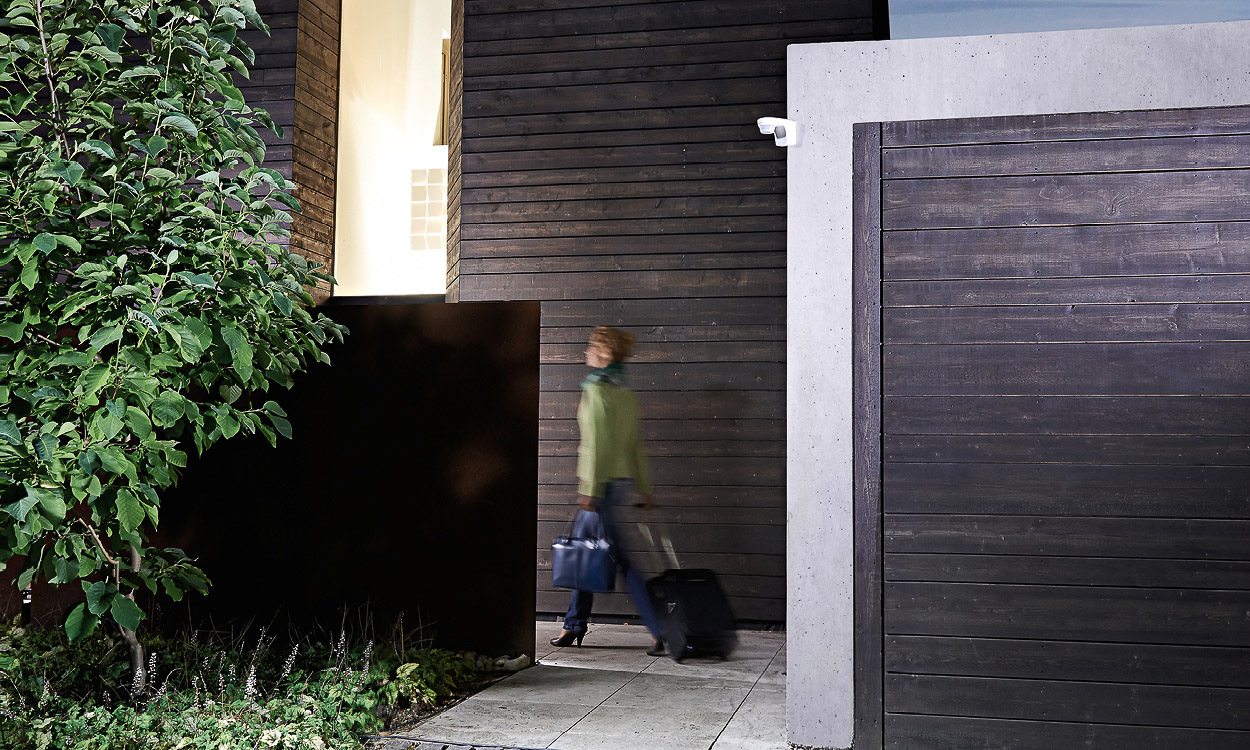
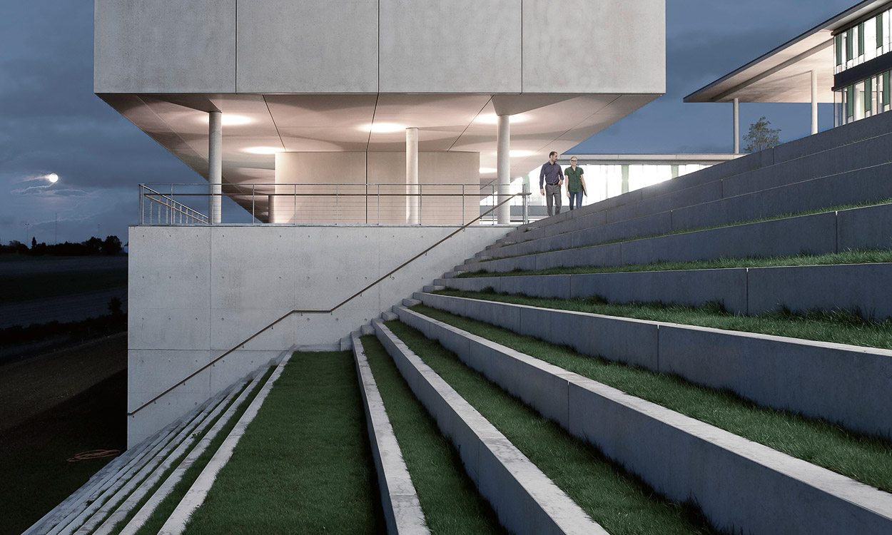
The emotional imagery presents users and beneficiaries of Theben's products. The rational and factual product photography clearly outlines the profile of what the customers receive.